Supporting people living with cancer

Working in a charity means creating a significant impact with minimal resources. My work at Macmillan consists of working together with tech and marketing teams to optimise and create new features and solutions to improve the online experience for people living with and affected by cancer.

About Macmillan Cancer Support

Macmillan Cancer Support is one of the biggest British charities and provides specialist health care, information and financial support to people living and affected by cancer.

https://www.macmillan.org.uk/

Macmillan Design System

Context

How can a small team of designers and developers create and evolve a shared Design System that bridges design and engineering? As the person directly responsible for this effort, my challenge was to advance Macmillan’s Design System as a parallel project while optimising user experiences and supporting other teams. This required advocating for the Design System’s value across the company, setting priorities effectively, establishing a clear roadmap, and balancing the maintenance of existing components with the thoughtful introduction of new elements to keep the system robust and relevant.

Main objectives

  • Ensure UX/UI consistency reducing friction for users to get their job done;
  • Accelerate development bringing efficiency and scalability across platforms;
  • Deliver higher quality production and reduce testing time;
  • Tighten collaboration between Dev & Design - through a shared vocabulary;
  • Put in place useful reference and practical tool kit for internal teams and 3rd party providers
  • Create a future proof foundation - grow and evolve the system with ease

Internal buy-in, foundational elements rationalisation and tokens implementation

Problem space

The biggest challenge was securing internal buy-in from the Technology team to get dedicated developer time for implementation. This required multiple meetings and presentations to demonstrate the benefits of a single source of truth provided by a Design System. At the start, there was a significant overlap of values, duplicated colours, and other parameters, leading to unnecessary complexity in the code library and difficulties in implementing new components and patterns.

Approach

I began by collaborating with developers to identify and eliminate duplicated values, simplifying the code library. We then established foundational tokens to create an organised and intuitive taxonomy, using semantic tokens where needed for clarity. This work demonstrated the value of the Design System, laying the groundwork for developing new components and optimising existing ones.

Main achievements

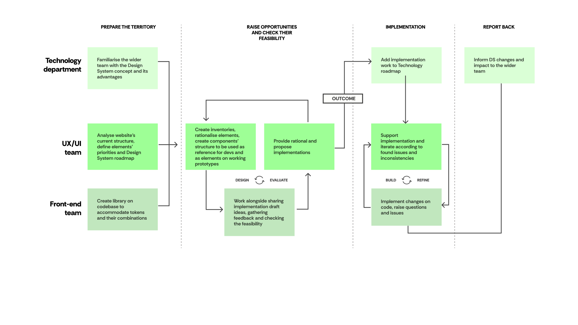
Design system implementation plan

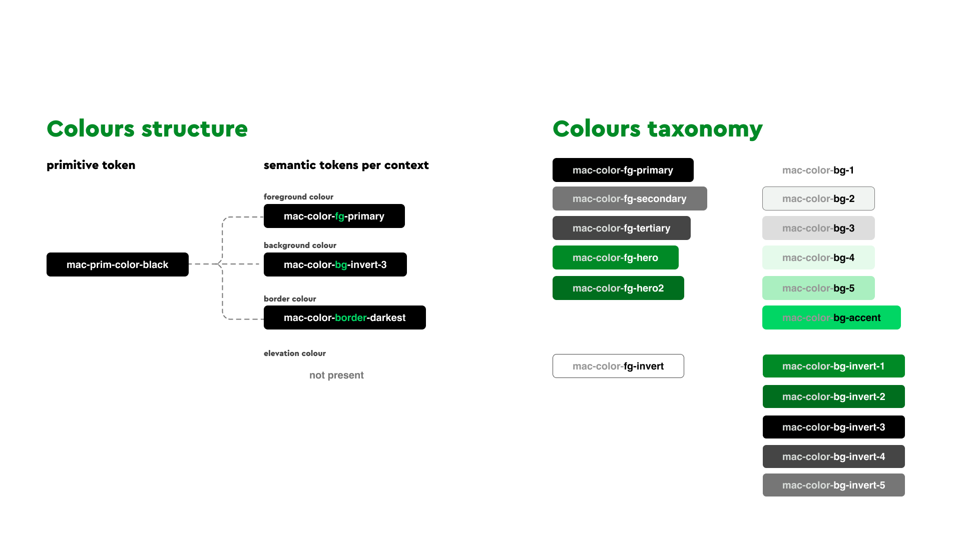
One single token generating different semantics to branch across different contexts. Colour tokens taxonomy built intuitively so designers and developers know which colours can be combined together.

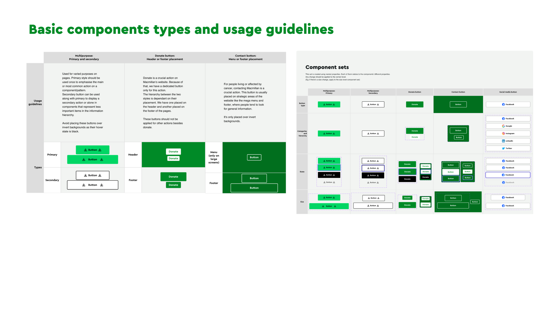
Creation of basic components (buttons and links) usage guidelines and component sets

Navigation improvements for fundraising sites

Context

Fundraising events are crucial to Macmillan’s revenue. In early 2023, a key priority was migrating two major events from legacy platforms to our current CMS. This required analysing dependencies and adapting key functionalities to fit within the CMS’s existing capabilities.
These constraints created challenges for users performing essential tasks, such as signing up for events and submitting funds.
Post-launch, I started to analyse and test user behaviour on the site and developed a plan to optimise navigation and refine the information architecture, improving the user experience for these key fundraising products

Main objectives

  • Analyse how users performed key actions on the websites and identify opportunities to improve their journeys;
  • Identify the primary pain points and explore potential solutions;
  • Design and test new navigation patterns to better align with the migration needs and provide a more tailored experience;

Clear separation of global and local navigation and improving mobile navigation exposure

Problem space

After conducting usability tests and analysing data from Google Analytics and Hotjar, I've found two main pain points:
. Desktop users were clicking on global links by mistake and moving out of the Fundraising websites;
. Mobile users relied on pages' content to navigate through information without understanding the existing sections.

Approach

After conducting usability test for both mobile and desktop patterns, I mapped the main areas of confusion and proposed new ways to display the information based on benchmarking and UX best practices.
Since Macmillan acts in different scenarios and has different users segmentations, we decided to use this project as a pilot to test this new navigation pattern and start studying how this new pattern will apply to other areas like getting information about cancer and information for healthcare professionals.

Main achievements

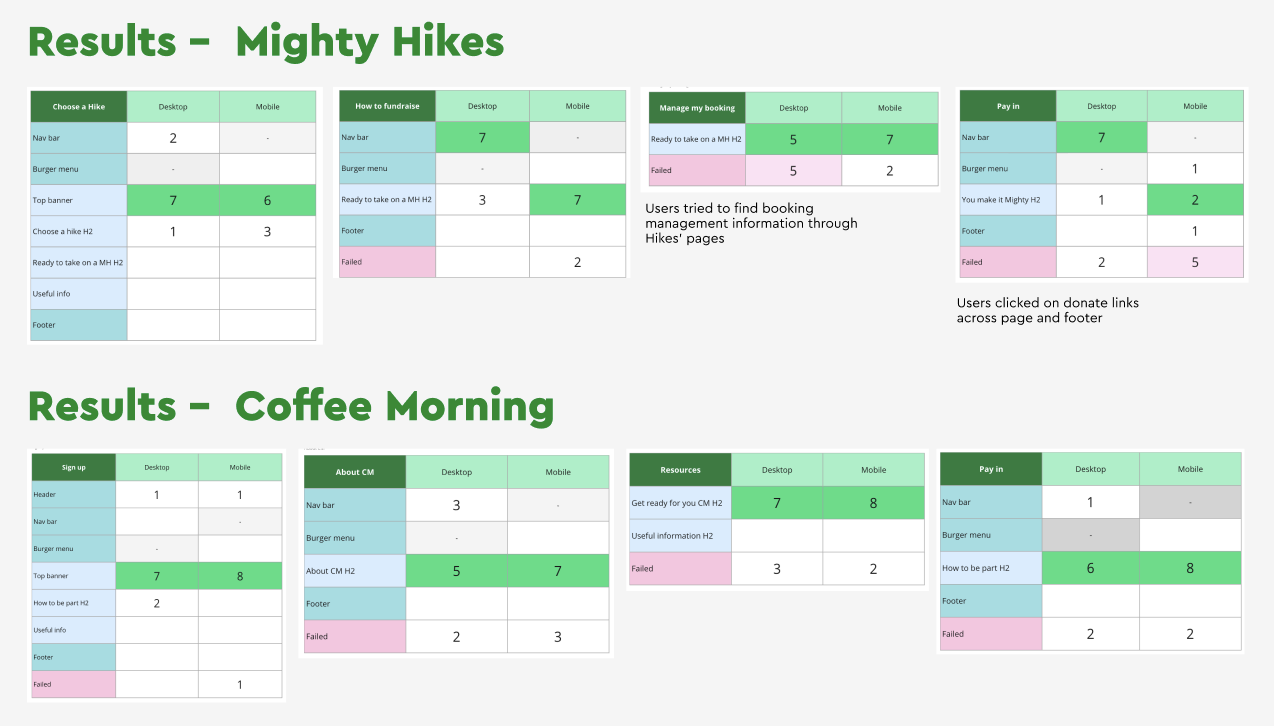
Usability test results for users main actions

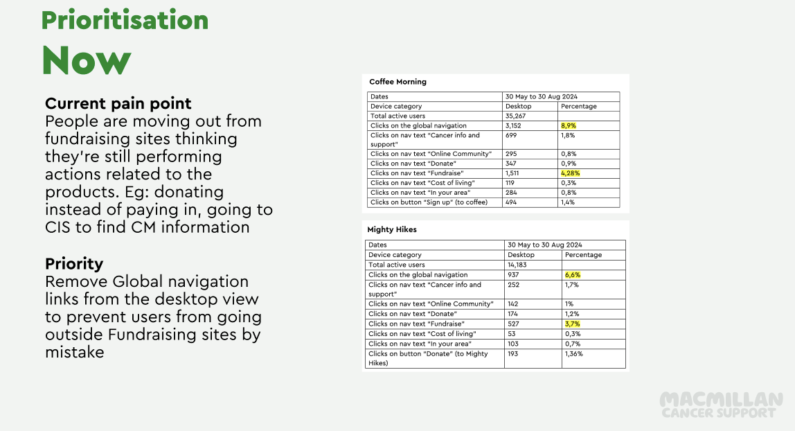
Prioritisation plan for desktop behaviour

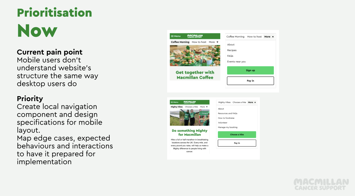
Prioritisation plan for mobile behaviour

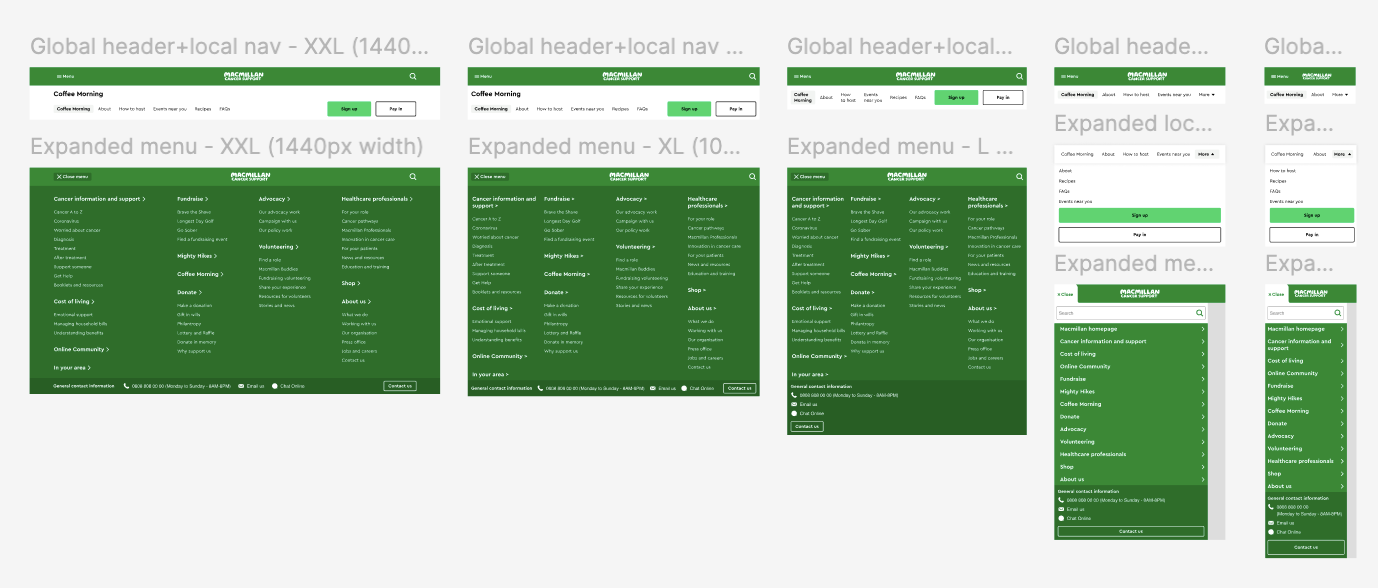
New components for desktop and mobile navigation